*Disclaimer: The values and predictions presented in this blog post are entirely random and do not reflect actual findings. Additionally, this project was not conducted on behalf of the PvdA.
Optimizing Campaigning Efforts for the 2026 Municipal Elections
With the 2026 municipal elections coming up, efficient campaigning is crucial, given that there are only so many volunteers. This model aims to help identify key neighborhoods with potential for vote growth—places where campaigning can truly make a difference.
To achieve this, it is important to first get a sense of how the PvdA is currently viewed in each neighbourhood. To this end, I built and cross-validated a machine learning model to estimate the current percentage of PvdA voters per neighborhood, using ~700 features including historical voting behavior and socioeconomic indicators (e.g., housing density, access to healthcare facilities, etc).
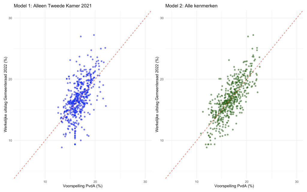
Relying solely on previous election results for how popular the PvdA is in each neighbourhood would leave out important information. This is evident in the comparison below (each of the 511 dots represents a neighborhood in Amsterdam).
- Left plot: Predictions from Model 1 (x-axis) vs actual 2022 municipal election results (y-axis). Model 1 uses only past election results. (Adjusted R² = 0.343)
- Right plot: Predictions from Model 2 (x-axis) vs actual 2022 results (y-axis). Model 2 uses the full feature set (~700 variables). (Adjusted R² = 0.512)
*The red dotted line indicate perfect predictions.
Neighbourhood predictions
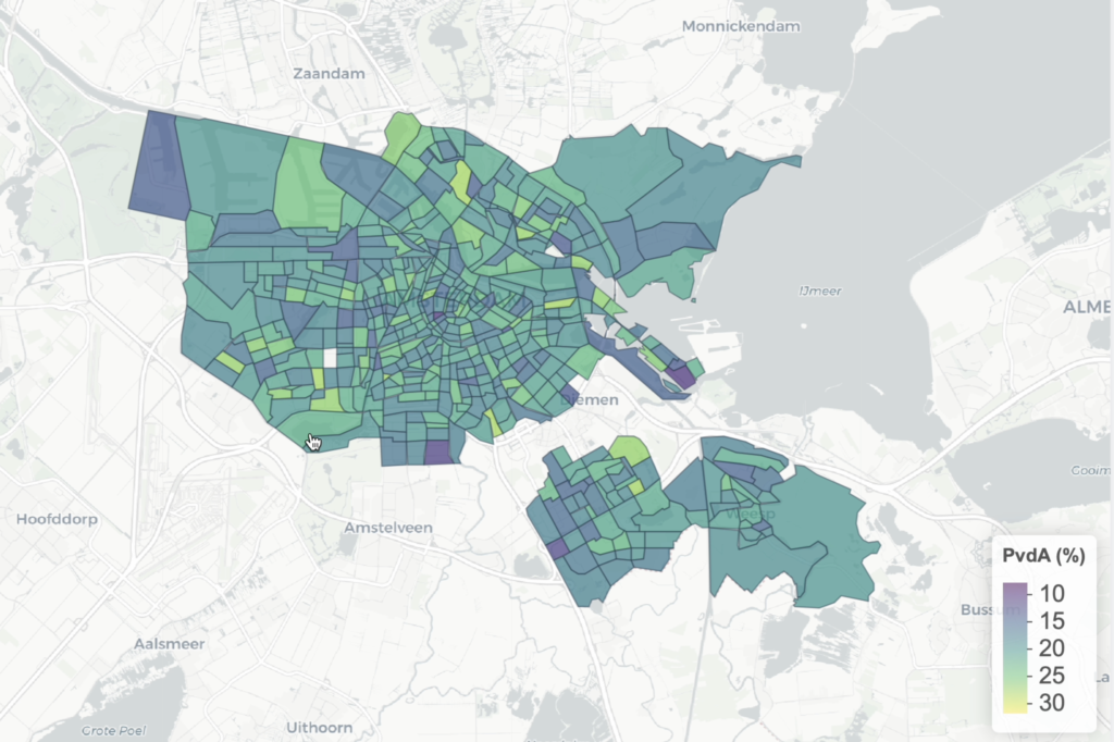
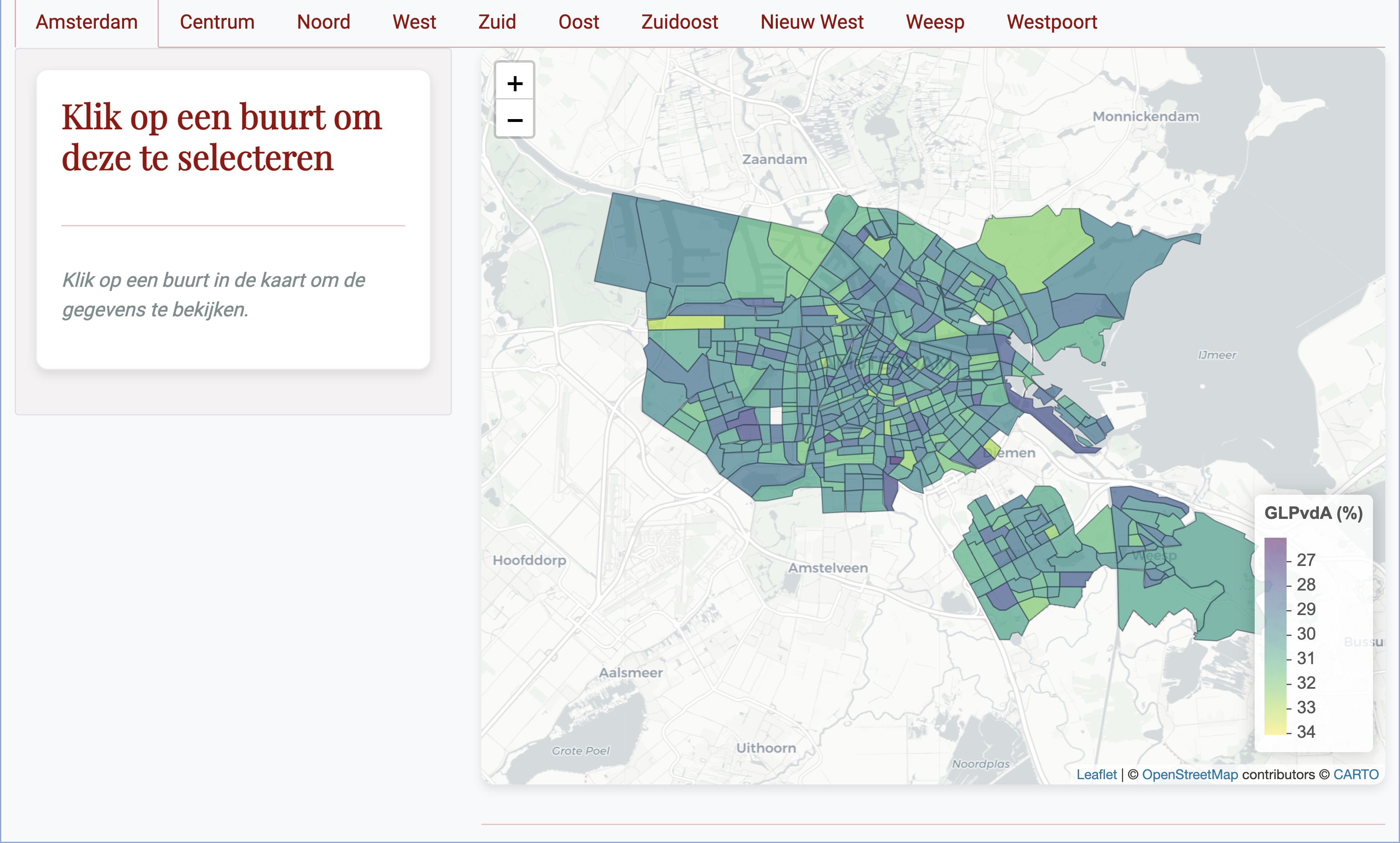
This map of Amsterdam displays the model’s current predictions: the estimated percentage of voters in each neighborhood who would vote for the PvdA at this moment, based on the most recent available data.
Note: As mentioned earlier, the values shown on this map are randomly generated for demonstration purposes.
Election Results
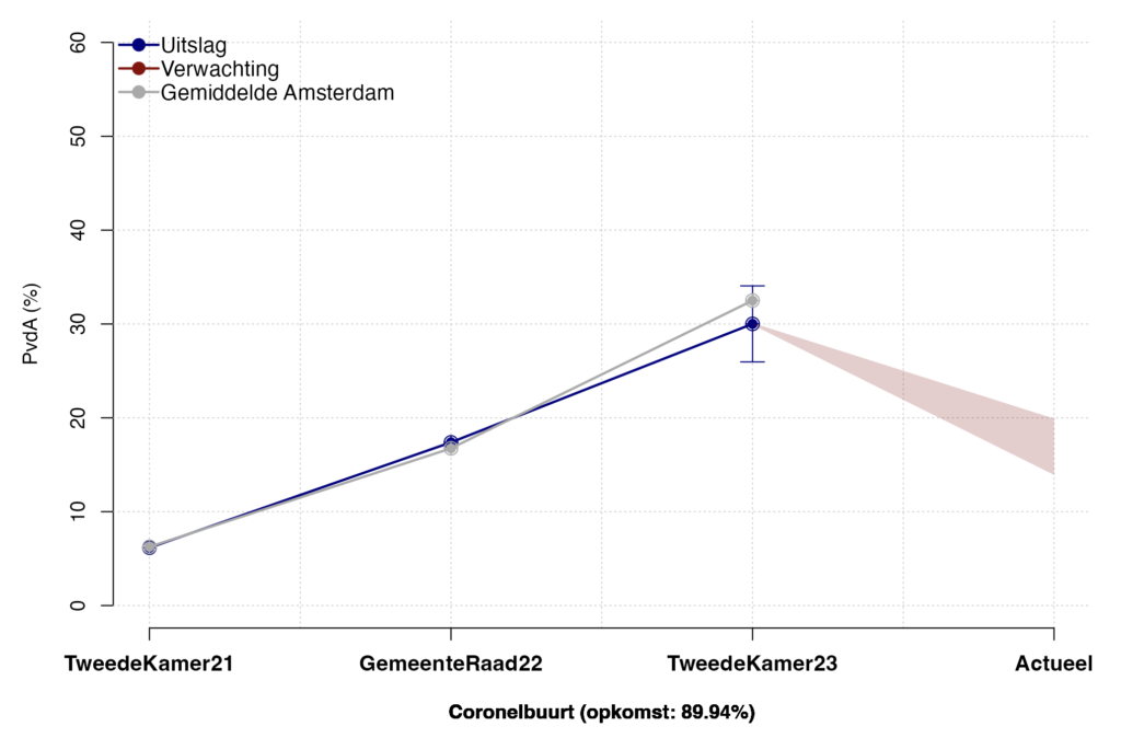
This plot displays for each specific neighbourhood the PvdA election results for the past 3 election cycles, together with the prediction for the current percentage of PvdA voters (with an uncertainty margin). The error bar around the prediction for the ‘TweedeKamer23‘ reflects the average (%) difference between the voting locations within one neighbourhood concerning PvdA.
Beneath the plot you see the ‘opkomst (%)’, voter-turnout. This is calculated as the amount of people who voted in that neighbourhood divided by the amount of people who were invited to vote in that neighbourhood.
Key Characteristics & Top Contenders
The application contains more plots that cover key characteristics for each neighbourhood and the top contending political parties but they only become available with a password.
Leave a Reply